


Table of Contents
In any report that includes data analysis results, you will see some visualizations. There are many reasons why most data analysts include visualization, but they all tie back to the fact that humans react better to visual stimuli than any other type of stimuli. Cornell University proved this when it found out in its research that including a simple graph with a report increases the number of people believing in its accuracy and truthfulness by a whopping 42%.
Python offers many efficient methods to create visualizations. In this article I will focus on building data visualizations from scratch. I’ll cover many topics, from simple line plots to subplot management. To create these visualizations, I will use the Matplotlib library.
What is Matplotlib?
Matplotlib is a powerful data visualization library for Python. It is easy to use and offers a wide range of customization options. It allows you to, using just a few lines of code, quickly create line plots, scatter plots, bar charts, pie charts, and much more. The library makes it easy to plot data that is stored in lists, NumPy arrays, Pandas series, and more.
- Python Data Processing: What is NumPy?
- Python Data Processing: What Are NumPy Ndarrays?
- Intro to Pandas: What is Pandas in Python?
Generally, you plot a variable against another: one for the x-axis and the other for the y-axis. Plotting is facilitated through the matplotlib.pyplot module.
Let’s import the matplotlib module:
# Import the module we will use for plotting
import matplotlib.pyplot as plt
There are many different plots you can create and I’ll explain the most commonly used ones.
Article continues below
Want to learn more? Check out some of our courses:
How to Create Line Plots Using Matplotlib
Line plots offer clear visuals for how one variable evolves with respect to another, especially with respect to time. Good examples are stock prices, weather, and average sales in a retail store.
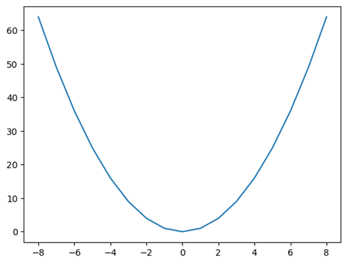
Creating a simple 2D line plot is easy: you simply need to use the plot() function to demonstrate how a change in variable x is connected to a change in variable y:
# Create example data
x = [-8, -7, -6, -5, -4, -3, -2, -1, 0, 1, 2, 3, 4, 5, 6, 7, 8]
y = [64, 49, 36, 25, 16, 9, 4, 1, 0, 1, 4, 9, 16, 25, 36, 49, 64]

# Create example 2D line plot
plt.plot(x, y)

# Display the plot
plt.show()
The code above will create the following graph.
If you are in a Jupyter notebook, the image below will appear as an output, and if you are running a script the image will pop up on your screen:
A line plot created using Matplotlib using the plot() function.
Image Source: Edlitera
The plot looks pretty nice but is a bit bare. There is not much detail on it right now except for the line itself and the ticks on the x axis and y axis. Matplotlib allows you to create much more complex visualizations that include a lot more detail. To be more precise, the Pyplot module admits several formatting parameters, the most important ones being color, linestyle, and marker.
You can set the color parameter in a variety of ways:
- A string with the complete color name, such as blue, green, darkblue, etc.
- A hex string, such as #0000FF for blue
- A tuple of RGB values, such as (1, 0, 0) for red
- With a single letter string: g for green
You can define the style of line you want to use by using the parameters below:
- - : solid line style
- -- : dashed line style
- -. : dash-dot line style
- : : dotted line style
- None : no line
Finally, you can define what type of marker you want to use by inputting one of the following values:
- . : point marker
- , : pixel marker
- o : circle marker
- v : triangle down marker
- ^ : triangle up marker
- < : triangle left marker
- > : triangle right marker
- s : square marker
- p : pentagon marker
- * : star marker
- h : hexagon1 marker
- H : hexagon2 marker
- + : plus marker
- x : x marker
- D : diamond marker
I’ll demonstrate in an example.
I'll create a red dash-dotted line with hexagon markers:
# Create a plot with a red dash-dot line and hexagon markers
plt.plot(x, y, color='r', linestyle='-.', marker='H')

# Show the plot
plt.show()
The code above will create the following visualization:
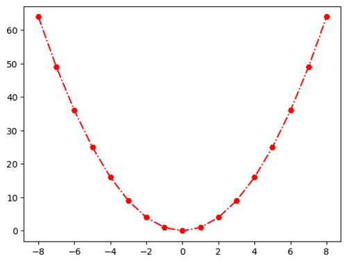
Image Source: Edlitera
You can pass the three arguments that define the color, style, and markers in one string.
For example, the following code will create the same visualization I created a few moments ago:
# Create a plot with a red dash-dot line and hexagon markers
plt.plot(x, y, 'r-.H')

# Show the plot
plt.show()
However defining how you want to format the plot in this way is pretty messy, hard to read, and is not recommended.
How to Create Bar Plots Using Matplotlib
Bar plots excel in presenting quantities related to sparse values of x. If you want to see the daily sales evolution in the last month, you use a line plot, but if you want to compare the revenue between the previous quarters you can use a bar plot. Bar plots are also often used when you analyze categorical data: for example, to describe the items and their quantities in stock.
Finally, you can also use bar plots to compare nearby values. For example, to compare the revenue of a company in June with the revenue of that same company in July.
The main syntax for bar plots is plt.bar(x, y). Here y stands for the list of bar heights above the x-values. To demonstrate, I’ll plot Tesla's quarterly gain in 2020.
In the graph below quarters and gains are actually the x and y values respectively, I just named them differently for this example:
# Create a list of labels for the x-axis
quarters = ['Q1', 'Q2', 'Q3', 'Q4']

# Create a list of Tesla's gains
gains = [1234000000.00, 1267000000.00, 2063000000.00, 2066000000.00]

# Create a bar plot with quarters and gains
plt.bar(quarters, gains)

# Show the plot
plt.show()
The code above will create the following visualization:
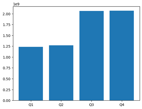
Image Source: Edlitera
The bar function admits formatting parameters such as color, edgecolor, and linewidth. The first determines the color of the bars, and the last two the color and thickness of their contour.
To demonstrate how you can manipulate the style of a plot, I’ll create a bar plot that has bars that are light green and have a red outline.
I will also modify the width of the lines, making them thicker:
# Create a plot with light green bars with thick red borders
plt.bar(
	quarters,
	gains,
	color='lightgreen',
	edgecolor='r',
	linewidth=2)

# Show the plot
plt.show()
The code above will create the following visualization:
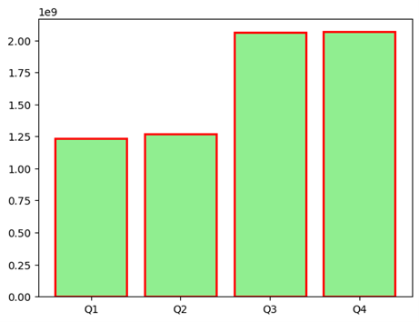
Image Source: Edlitera
There is one extra thing you can do when creating bar plots and that is have bars that are formatted differently. To this end, you can pass a list of parameters for each argument. The three parameters must be either lists of the same shape or single instances. Pyplot distributes the formatting instances cyclically.
For example, let's create a bar plot where I will use RGB tuples to create a gradient-like effect on the bars and fix the borders' color to blue:
# Create an array of colors
colors = [(0,1,0),(0,0.75,0),(0,0.5,0), (0,0.25,0)]

# Create a plot with varying green bars with blue borders
plt.bar(quarters, gains, color=colors, edgecolor='b')

# Show the plot
plt.show()
The code above will create the following visualization:
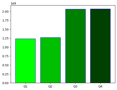
Image Source: Edlitera
The bar() function also allows you to include error estimates in the chart. Those are declared through the parameter yerr. It admits either a single scalar or an array matching the length of the x-list. The single scalar functions as a generic error, in both directions, plus and minus the plotted value.
I’ll demonstrate how you can create a bar plot with error estimates:
# Create the error parameter
yerr = 300000000

# Create a plot with varying green bars and standard error bars
plt.bar(quarters, gains, color=colors, yerr=yerr)

# Show the plot
plt.show()
The code above will create the following visualization:
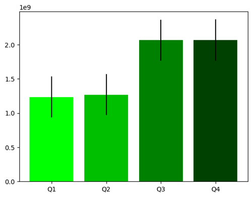
Image Source: Edlitera
If you want to define individual errors for each bar you can use arrays similarly to how I used them a few moments ago to change the colors of the bars.
I’ll demonstrate how you can create a bar plot where each of the bars have their own error value:
# Create an array with values for errors
yerr = [185100000.0, 190050000.0, 309450000.0, 309900000.0]

# Create a plot with varying green bars and varying error bars
plt.bar(quarters, gains, color=colors, yerr=yerr)

# Show the plot
plt.show()
The code above will create the following visualization:

Image Source: Edlitera
As can be seen on the graph above, the error lines on the shorter bars are notably smaller than the errors on the larger bars.
There is much more you can do with bar plots, so much that I can't cover everything in just one article. To learn more about bar plots, take a look at the official bar graph Matplotlib documentation.
How to Create Scatter Plots Using Matplotlib
Scatter plots are special types of visualizations used to observe relationships between variables. You use dots to represent the values of two variables to demonstrate how much one variable is affected by another. The pyplot module allows you to call this plot declaring only the x and y values.
To demonstrate how scatter plots work I’ll create some new example data in the form of arrays, then create a scatter plot that connects those two sets of data:
# Import what we need to generate data
import numpy as np

# Generate example data
# Consists of 100 random x values between 0 and 1
# and y values , which are slightly increased x values with some noise
x_scatter = np.random.rand(100)
y_scatter = x_scatter + np.random.normal(0, 0.1, 100)

# Create a plot with varying green bars and varying error bars
plt.scatter(x_scatter, y_scatter)

# Show the plot
plt.show()
The code above will create the following visualization:
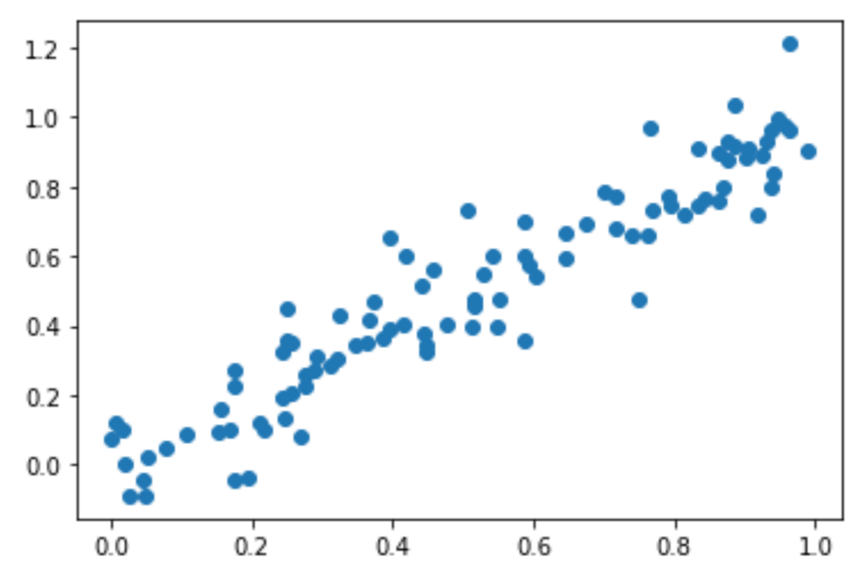
Image Source: Edlitera
Here you can see how the scatter plot helps you better understand the relationship between two variables. This is especially important for Machine Learning, where knowing that there is a strong correlation between variables, such as the one shown above, can be of paramount importance when you perform feature engineering, and even when you are picking the model you are going to use.
How to Create Pie Charts Using Matplotlib
Pie charts are special charts that represent data in a circular format, with each section, or "slice," of the pie representing a proportion or percentage of the total data. Each slice is usually represented in a different color or pattern, and the size of each slice corresponds to the quantity it represents. The whole pie represents 100% of the data. The central angle of each sector of the pie chart is proportional to the quantity it represents.
For example, with a pie chart, I can explore how Tesla's 2020 gains were divided between quarters. The syntax is, again, straightforward using the plt.pie() function. It only requires a single array. Each value, seen as a part of the total value, is represented as a part of the “pie.”
The code below plots Tesla's quarterly gains as a pie of 2020's earnings:
# Create a pie with the gains array
plt.pie(gains)

# Show the graph
plt.show()
The code above will create the following visualization:
Image Source: Edlitera
Here you can see that the orange and blue slices are much smaller than the green and red ones. Instead of trying to guess which is which, we can include labels in the graph. That is implemented through the labels argument.
I’ll use the quarters list as the labels:
# Create a pie chart with labels
plt.pie(gains, labels=quarters)

# Show the graph
plt.show()
The code above will create the following visualization:

Image Source: Edlitera
Finally, visually comparing proportions may be tricky. Therefore, it is good practice to always include fractions as labels. That is the autopct's role, an argument that admits a formatting string as a parameter. For your purposes, I’ll use a string of the form %.[precision]f%%, where I’ll replace [precision] with the number of decimal digits I wish to display.
I’ll demonstrate how to create a bar chart that includes percentages:
# Create a pie chart with labels and percentages
plt.pie(gains, labels=quarters, autopct='%.2f%%')

# Show the graph
plt.show()
The code above will create the following visualization:
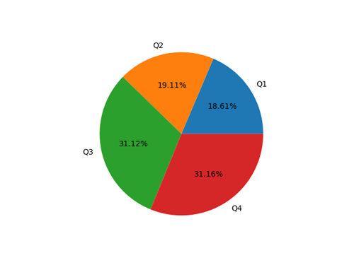
Image Source: Edlitera
How to Create Complex Visualizations Using Matplotlib
You can think of creating visualizations in Matplotlib as a two step process. First the figure gets created and then an AxesSubplot object gets placed on that figure. You can think of the figure as an empty canvas, on which you paint your plots. Up until now, I only painted a single plot on the canvas but I can actually put multiple plots on it.
Painting plots on a canvas is just a simplified explanation. How it actually works is you have a figure, which serves as a container that holds plot elements, and you store elements in that figure. Those elements can be AxesSubplot objects, text, labels, etc. In that respect, an AxesSubplot object is a container that holds the components of a single plot, such as the data, the x and y-axis labels, and everything else that defines the look of the plot.
You can create a new figure by calling the plt.figure() function. By default, it creates a figure with a single AxesSubplot object. You can also add extra subplots with the add_subplot() method. The add_subplot() method takes three arguments: the number of rows, columns, and the position of the subplot.
For example, the code below creates a 2x2 grid of subplots:
# Create a figure
fig = plt.figure()

# Place an AxesSubplot at the upper left portion of the figure
ax1 = fig.add_subplot(2, 2, 1)

# Place an AxesSubplot at the upper right portion of the figure
ax2 = fig.add_subplot(2, 2, 2)

# Place an AxesSubplot at the bottom left portion of the figure
ax3 = fig.add_subplot(2, 2, 3)

# Place an AxesSubplot at the bottom right portion of the figure
ax4 = fig.add_subplot(2, 2, 4)

# Show the figure
plt.show()
The code above will create the following visualization:
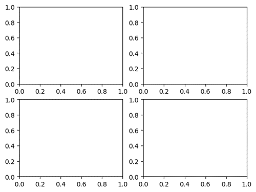
Image Source: Edlitera
Once you create the subplots, you can populate each AxesSubplot object with any plot you want. To do this, you would use the same syntax as before. Check the code below, where I create a figure with some of the charts introduced before:
# Create a figure
fig = plt.figure()

# Place an AxesSubplot at the upper left portion of the figure
ax1 = fig.add_subplot(2, 2, 1)

# Place an AxesSubplot at the upper right portion of the figure
ax2 = fig.add_subplot(2, 2, 2)

# Place an AxesSubplot at the bottom left portion of the figure
ax3 = fig.add_subplot(2, 2, 3)

# Place an AxesSubplot at the bottom right portion of the figure
ax4 = fig.add_subplot(2, 2, 4)

# Plot the first parabola into ax1
ax1.plot(x,y)

# Plot the first bar chart into ax2
ax2.bar(quarters, gains)

# Plot the noisy scatter plot into ax3
ax3.scatter(x_scatter, y_scatter)

# Plot the Pie chart into ax4
ax4.pie(gains, labels=quarters)

# Show the plot
plt.show()
The code above will create the following visualization:
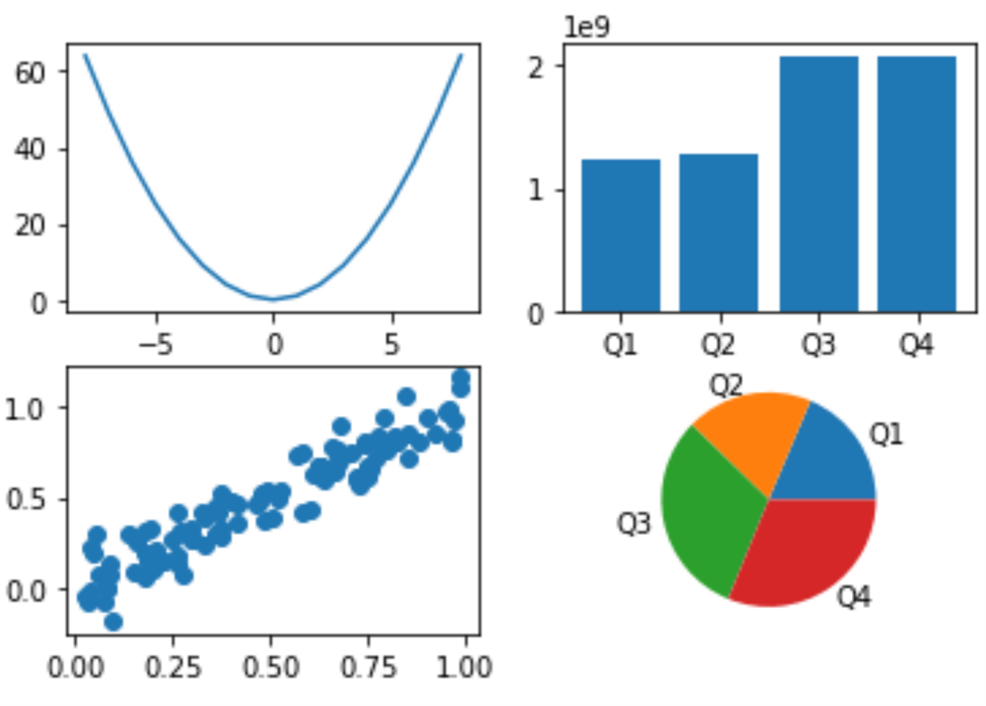
Image Source: Edlitera
There is another way you can get this same result, and that is using the subplots() function. It allows you to create a figure and a grid of subplots with a single call.
For example, to create a 2x2 grid of subplots, you can use the following code:
# Create a figure with a 2x2 grid of axes
fig, axs = plt.subplots(2, 2)
The returned axs element is a 2x2 numpy array with AxesSubplots. Each object can be accessed by its index: axs[row index, column index]. For example, the AxesSubplots corresponding to ax1, ax2, ax3, ax4 are respectively ax[0,0], ax[0,1], ax[1,0], ax[1,1]. The new notation makes it clear that the first two axes are in the first line inside the figure, and the last two are on the second line.
So, to recreate the visualization I created a few moments ago, I can use the following code:
# Create a figure with a 2x2 grid of axes
fig, axs = plt.subplots(2, 2)

# Plot the first parabola into ax1
axs[0,0].plot(x,y)

# Plot the first bar chart into ax2
axs[0,1].bar(quarters, gains)

# Plot the noisy scatter plot into ax3
axs[1,0].scatter(x_scatter, y_scatter)

# Plot the pie chart into ax4
axs[1,1].pie(gains, labels=quarters)

# Show the plot
plt.show()
I can also include multiple plots in a single axis. That is very useful for representing approximations or differentiating subsets of the data in a single graph. I can easily accomplish that by calling plotting methods on a single axis before calling show().
For example, I’ll create a new scatter plot and calculate and visualize the line of best fit that goes through that scatter plot:
# Generate example data
x = np.random.rand(100)
y = -x + np.random.normal(1, 0.1, 100)

# Create a line of best fit
coefficients = np.polyfit(x, y, 1)
p = np.poly1d(coefficients)

# Plot the data
plt.scatter(x, y)
plt.plot(x, p(x), color='r')
plt.show()
The code above will create the following visualization:
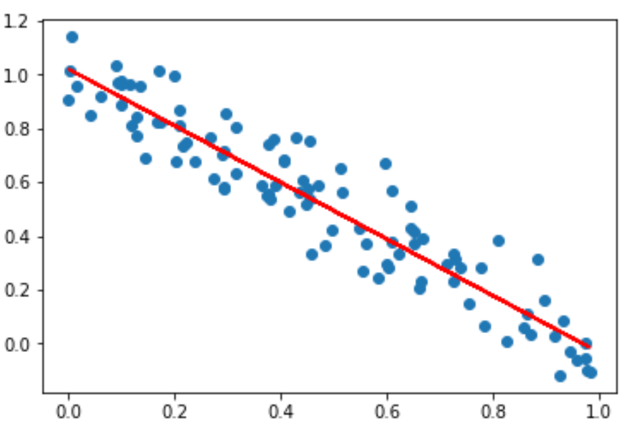
Image Source: Edlitera
There are several reasons why Matplotlib is considered the most important library for creating visualizations in Python. It is very customizable, it is compatible with the most important data processing libraries, it produces high quality visualizations and it allows you to create many different types of visualizations.
In this article I covered the basics of using Matplotlib for creating visualizations. I demonstrated how to create the most important types of plots, and how to customize them to a certain degree. Later I also demonstrated how to create more complex visualizations, that include multiple graphs inside of them or visualizations where you create two different types of plots using the same x and y axes. In the next article, I am going to demonstrate how you can further customize matplotlib visualizations, alongside with how to use Seaborn and Pandas for creating plots.

