


Table of Contents
Principal Component Analysis (PCA) is an unsupervised learning algorithm used in Exploratory Data Analysis and Dimensionality Reduction. It aims at creating vectors that encapsulate the essence of the whole dataset. These vectors can be used to produce a reduced number of features, bringing several advantages to the project. Reducing the number of dimensions allow you to visualize the data. It also increases interpretability and processing speed. In addition, PCA reduces noise and bias towards highly correlated features.
This article will discuss how to implement PCA using scikit-learn and how to visualize data using it. I’ll illustrate its usage by applying it to UCI's Wine Dataset's classification problem. The complete code can be found at the end of this article.
What is Principal Component Analysis?
The Principal Component Analysis (PCA) aims at Dimensionality Reduction. Think of a photo and how it depicts a person, a 3-dimensional object, in a 2-dimensional frame. That is an example of a projection from the 3D space to a 2D plane. The picture is easier to process but bears disadvantages. It generally loses information. A front photo will not cover the person's back, nor will distances be precise.
Now, think of your data as an object living in a multidimensional world. The PCA finds the best possible angle to take a photo in a dimension you can adjust. The remainder usually consists of noise or is less significant. The PCA accomplishes that by choosing the most expressive directions inside your data, the PCA vectors.
Let’s compare the images below:
Image Source: Edlitera
Here, the first PCA vector is a nearly diagonal line and captures the best combination between age and charges. The last PCA vector mainly consists of outliers.
In a generic situation, the data has more than two features, so more than two dimensions. Finding essential directions (the best angle to take a photo) is vital for visualization. Some dimensions might exist due to noise and outliers and discarding them brings clarity and efficiency. The PCA will also find those unnecessary dimensions for you.
- What Question Can Machine Learning Help You Answer?
- How to Set Up a Machine Learning Project as a Business Leader
Article continues below
Want to learn more? Check out some of our courses:
How to Implement PCA in Python
Scikit-Learn provides a PCA implementation through the class sklearn.decomposition.PCA. You can represent it with several optional parameters, the most important being the number of components to output. The latter can be either selected by hand or set to mle, triggering Minka's selection algorithm to choose an optimal number of components to output.
Here, I’ll use two PCA components for illustration:
Loading the dataset
Scikit-learn offers a handful of toy datasets available from its python API. Those are simple datasets with well-known properties that allow you to test new tools and models. One is the wine dataset that contains several measurements from wine produced by three nearby farmers. It possesses 178 rows, each representing a batch of wine. Each row comprises 13 chemical measures and a label identifying the farm. The aim is to determine the wine's origin using the measures.
I can load the wine dataset as a pandas.DataFrame using the function sklearn.datasets.load_wine with the parameter as_frame=True:
from sklearn.datasets import load_wine
import pandas as pd
import numpy as np

# loading the wine dataset:
data = load_wine(as_frame=True)
The output is a dictionary-like object with the following entries:
- ‘data’- the feature frame. I.e., the data set with the labels removed
- ‘target’- the target series or DataFrame, depending on the number of target columns
- 'frame' - only present when as_frame=True. A DataFrame with data and target
- 'feature_names' – an array with the feature and the class names that already incorporates in the 'data' DataFrame.
- 'target_names' – an array that features the class name. target_names in this case are just 'class_0', 'class_1', and 'class_2'
- ‘DESCR' - a thorough description of the dataset, including references
I’ll assign two variables to the relevant part of the output:
# extracting the feature and label frames from the load_wine output
X = data['data']
y = data['target']
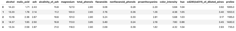
X.head()Out:
First five rows of UCI's Wine Dataset.
Image Source: Edlitera
PCA is an unsupervised algorithm. Therefore, it must be applied to the feature set. I’ll discuss its best practices in the next section.
How to Implement PCA and Visualize the Result
The PCA class is loaded from sklearn.decomposition and follows the usual sklearn fit-transform workflow.
I’ll instantiate the class below to output two PCA vectors:
from sklearn.decomposition import PCA

# Instantiating and fitting the PCA class
pca = PCA(2)
pca.fit(X)
Once I pass a table to the fit method, the PCA instance finds the necessary processes to transform the given data into the vectors that better represent the data in the table. The transform method is then used to apply these processes row-wise to any 2D-array with the same number of columns. Its output is the projection of each row the PCA vectors computed during the fit method.
In this case, I apply the transform to X itself (note that X has remained unchanged so far). I then convert the result into a DataFrame for better manipulation.
# transforming the data into its PCA components
X1 = pca.transform(X)
# wrapping the result into a DataFrame
X_pca = pd.DataFrame( X1, columns=['PCA_component_1', 'PCA_component_2'])
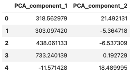
X_pca.head()Out:
PCA features created from the first five rows of the dataset.
Image Source: Edlitera
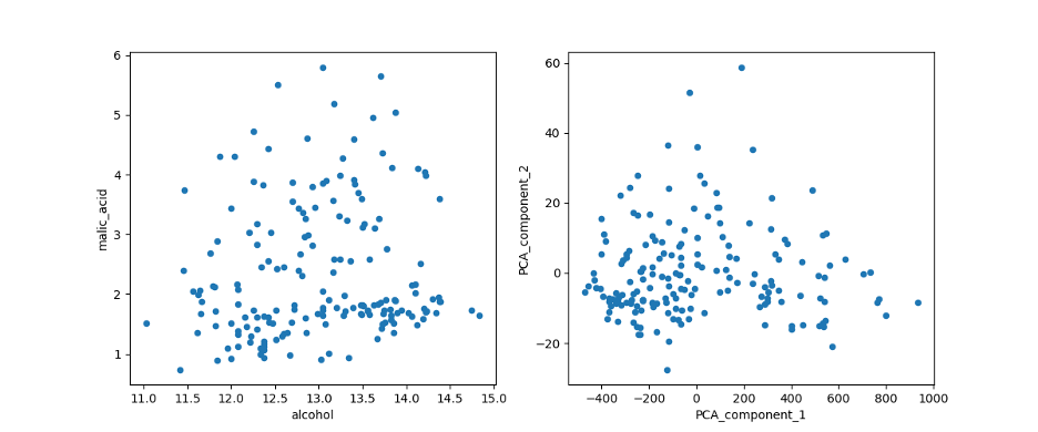
To compare X and X_pca, I plot the first two columns of the former against the two PCA components in the latter.
import matplotlib.pyplot as plt

# plotting malic_acid vs. alcohol against the first two PCA components
plt.figure(figsize=(12,5))

ax1 = plt.subplot(1,2,1)
X.plot(kind='scatter', x='alcohol', y='malic_acid', ax=ax1)
ax2 = plt.subplot(1,2,2)
X_pca.plot(kind='scatter', x='PCA_component_1', y='PCA_component_2', ax=ax2)
plt.show()
Out:
Comparing the plot of the first two features of the Dataset (left) with the first two PCA features (right).
Image Source: Edlitera
You’ll notice that the transformation concentrated the points, limiting them to a triangular region. Moreover, the PCA allowed me to represent all 13 dimensions of the data in a plot, as opposed to 'malic acid' and 'alcohol' which cover only two. The representability of the 13 dimensions will be further explained in the model training section.
The concept of feature importance inherent to the paragraph above leads to the notion of explained variance of the PCA components, which I’ll discuss in a forthcoming article. First, let’s understand some good practices when applying PCA to a Machine Learning problem.
What Are PCA Best Practices?
A Machine Learning engineer must be constantly aware of Data Leakage and the peculiarities of each algorithm. A common practice is to gauge a model's success on unseen inputs and to split the available data into train and test sets. That way, you train the model with the former and use the latter as unseen data. Data leakage happens when some information about the test set is used during training.
An example of leakage is replacing a missing value with the average of the whole column. Instead, you should use the average of the part related only to the train set. Analogously, scalers and PCA must be fitted only on the training set.
On the other hand, PCA works better with standardized data. Here you fit both the PCA and StandardScaler instances on the training set and then transform both train and test data.
If you keep track of the Machine Learning workflow, the care indicated in the last paragraph will make sense. Once you train the model with a PCA-transformed set, the model will be expecting similar PCA-transformed sets to make predictions. So, you must transform the test set and any other incoming data as well. The PCA becomes part of the model's pipeline.
Below, I illustrate the good practices of scaling and train-test split with PCA. I include an unscaled version of the sets, for comparison. I’ll choose the test as a 20% fraction of the total data.
from sklearn.model_selection import train_test_split
from sklearn.preprocessing import StandardScaler

# splitting into train and test sets
X_train, X_test, y_train, y_test = train_test_split(X, y, test_size=0.2)

# instantiating the Scaler and the two PCAs to be used in scaled and unscaled training sets
ss = StandardScaler()
pca = PCA(2)
pca_scaled = PCA(2)

# fitting and transforming the unscaled X_train, X_test. I wrap the result into DataFrames, recovering the index from y_train, y_test
pca.fit(X_train)
X_train_pca = pd.DataFrame(pca.transform(X_train), columns=['PCA component 1', 'PCA component 2'], index=y_train.index)
X_test_pca = pd.DataFrame(pca.transform(X_test), columns=['PCA component 1', 'PCA component 2'], index=y_test.index)

# fitting the scaler and transforming the scaled X_train, X_test. To make them DataFrames, I recover the columns from X
ss.fit(X_train)
X_train_scaled = pd.DataFrame(ss.transform(X_train), columns=X.columns, index=y_train.index)
X_test_scaled= pd.DataFrame(ss.transform(X_test), columns=X.columns, index=y_test.index)

# using PCA in the scaled X_train, X_test
pca_scaled.fit(X_train_scaled)
X_train_scaled_pca = pd.DataFrame(pca_scaled.transform(X_train_scaled), columns=['PCA component 1', 'PCA component 2'], index=y_train.index)
X_test_scaled_pca = pd.DataFrame(pca_scaled.transform(X_test_scaled), columns=['PCA component 1', 'PCA component 2'], index=y_test.index)
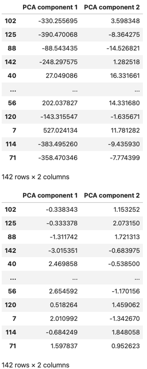
The resulting datasets are remarkably distinct. The two PCA-transformed ones are displayed below:
display(X_train_pca), display(X_train_scaled_pca)Out:
The PCA components resulting from the original Dataset (top) versus the ones resulting from the Standardized Dataset (bottom).
Image Source: Edlitera
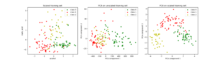
Plotting them is enlightening. Below we plot all three training instances:
- The 'alcohol' and 'malic_acid' features from the original X_train
- The PCA components from the unscaled X_train, X_train_pca
- The ones from the scaled X_train, X_train_scaled_pca
It changes the color (hue) of the data point following its label. Instead of copying and pasting, I’ll write a function to perform the plot.
# Defining a function to change the hue by class:

def plot_scatter(X, y, ax, title):

    # produces a scatter plot of the first two columns of x on the axis ax. The points are colored according to the labels in y returns the axis.
    X[y==0].plot(kind='scatter', x=0, y=1, c='g', ax=ax, label='class 0')
    X[y==1].plot(kind='scatter', x=0, y=1, c='r', ax=ax, label='class 1')
    X[y==2].plot(kind='scatter', x=0, y=1, c='y', ax=ax, label='class 2')

    # set ax's title as title
    ax.set_title(title)
    return ax
# using the pyplot.subplots to create an array of three plots
fig, axs = plt.subplots(1, 3, figsize=(18,5))
# Plotting the different training sets using the function I just defined:
plot_scatter(X_train_scaled, y_train, axs[0], 'Scaled training set')
plot_scatter(X_train_pca, y_train, axs[1], 'PCA on unscaled training set')
plot_scatter(X_train_scaled_pca, y_train, axs[2], 'PCA on scaled training set')
plt.show()
Out:
From left to right: visualization points in the training set from the first two original features; from the first PCA features; and from the PCA features generated from the standardized Dataset. The three colors represent the three different classes in the labels.
Image Source: Edlitera
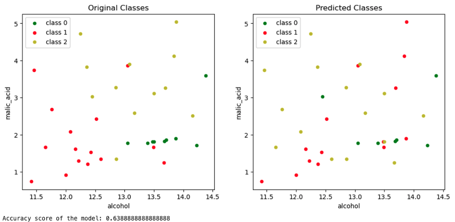
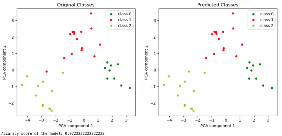
To illustrate how much information the two PCA vectors enclose, I created two models: a K-nearest neighbor model trained on X_train and another trained on X_train_scaled_pca.
The graph on the left-hand side represents the Malic Acid vs. Alcohol plot with their original classes. The one on the right-hand side plots the classes of X_test predicted by the model trained on X_train.
Plotting the original features of the test set, comparing the authentic labels (left) with the predicted ones (right).
Image Source: Edlitera
Below, the analogous graphs for the model trained on X_train_scaled_pca.
Plotting the PCA components of the standardized test set together with its labels, original on the left and predicted on the right.
Image Source: Edlitera
In this case, there was no information lost, apart from the improvement of the accuracy score.
If you are interested in a complete example of a Machine Learning project using PCA, follow to the next article. There, I’ll use a facial detection task to dive into the question: how many PCA components should you choose?
- Read next in the series: What is the Math Behind Advanced Prinicpal Component Analysis? > >

