


Table of Contents
Data is the fuel that drives modern society. You see it presented in a wide variety of formats, such as news, sports, advertisements, social media, e-commerce, healthcare, etc. There is a pervasive presence of data in our modern lives, but there's also no denying that some people may use it either intentionally or unintentionally to manipulate or mislead others. Thus, it's more crucial than ever to have a firm grasp of data and an understanding of the consequences of misusing it.
- Intro to Programming: What Are Different Data Types in Programming?
- Pitfalls in the Data Science Process: What Could Go Wrong and How to Fix it
This article will give you an overview of some of the most common types of misleading data or statistics, how to spot bad data, and how to minimize the impact it has on your business and life.
What Are Common Examples of Misleading Data?
Today, data is used by virtually every business sector to plot out their marketing road maps, report on their financial standing, and drive decision-making on their daily operations. Data misuse is mostly common in sectors such as government, politics, and non-profit organizations.
The media, social media, and other forms of online information are also frequent sources of misleading data. If you want to make good choices in your personal and professional life, you need to be able to spot and avoid misleading data.
The following are a few scenarios in which data can be misleading:
- Relying on a sample size that is too small. For example, if you find out that 60% of people like a product but you only polled 5, that's not a very reliable statistic. Sample sizes that are too small for a given population produce unreliable results. Use caution when relying on sources that only provide a percentage without also providing the total number of people in the sample.
- Neglecting to mention or detect sampling bias when calculating a statistic. An attempt to deliberately omit or adjust data to prove a point that often results in a statistical error is called “selective bias.” To avoid this, it is best to use a random sampling method, especially when dealing with people of different ages or other demographics.
- Making assumptions based on faulty correlations and causations that create false statistics or misleading insights. For example, an increase in road accidents might be correlated to several ongoing road constructions, but this does not prove that road constructions are to blame for the rise in accidents.
- Using leading or manipulative words or phrases in surveys or polls. Such as questions that are answerable only by “yes” or “no,” and somehow directly affects how the person answers. For example, “wouldn’t you agree that working from home is more productive than working from the office?” This is a leading question, and most respondents would likely be compelled to answer automatically, “yes.”
- Presenting data in graphs, charts, or other visualizations with unclear or misleading labels. One common example is truncating or manipulating the X or Y axis from a graph, such as starting the axis from a predefined value other than zero. This technique is often used in politics or advertising to exaggerate results in a way of persuading people.
- Mining and analyzing large volumes of data for unethical purposes. Assuming correlations between data points without a hypothesis or further study is also known as “data fishing,” or “data dredging.” This practice is often used to purposely get more supporting data conclusions that enforce certain views or findings, while omitting those that contradict them.
How to Spot Misleading Data
What exactly is bad data or statistics? It is simply faulty information or insights brought about either intentionally or unintentionally within the three phases of data research and analysis: collecting, processing, and presenting. Bad statistics may exist in several real-world scenarios, such as media, news, advertising, campaigns, politics, science, and more.
At the very least, being aware of the most common ways in which statistics is misused should at least help avoid making bad decisions based on misleading insights.
Some examples of how to spot potentially misleading data:
Article continues below
Want to learn more? Check out some of our courses:
Omitted Baselines
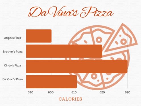
Normally, the baselines on graphs or charts start with 0. However, some would skew the value to start at a specific number to present a favorable result. The following example shows a misuse of statistics in advertising wherein the baseline value (X axis) starts with 590 instead of zero. This representation may impose that one brand of food product is healthier than another when, in fact, the intervals are not significant:
Figure 1. Bar Graph showing calories compared from different pizzas from the fictional Da Vinci’s Pizza. The graph starts at 590 calories. It seems to show that Angel’s Pizza, at 600 calories, is healthier than Cindy’s Pizza, 630 calories, when, in fact, the difference between them is minimal.
Misuse of Dual Y-Axis
Using dual axis in charts can be beneficial when presenting two related series of data, at different scales (such as very large values vs small values). However, if a dual-axis chart is manipulated in a way that conveys misleading results, then it may be difficult to identify its validity without digging into the actual raw data.
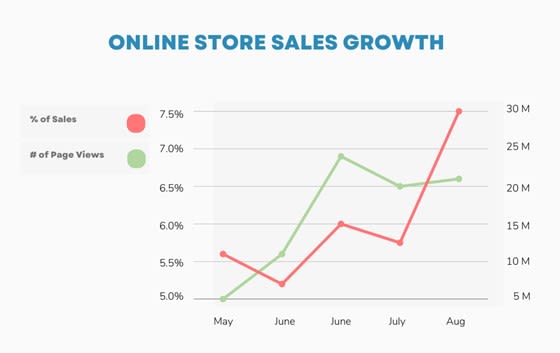
An example below shows a graph with two Y-axes that aims to present an accelerating growth in sales and the number of page views. Even though the Y-axis on the left and right don't directly correspond, the statement may appear to be true at first glance even though the numbers on the labels don't make much sense.
Figure 2. Line graphs showing the increase in % of sales to the # of page views for a fictional online store from May to August. The X-axis represents the months, and Y-axis represents the percent increase in Sales and increase in Page Views (in millions). Even though the graph appears to be increasing rapidly, the left and right Y-axes do not correspond with each other.
Incomplete Data
Some graphs purposely show only part of the data to amplify a statement or create a dramatic effect. When important data is omitted, the results may become more appealing, but less credible.
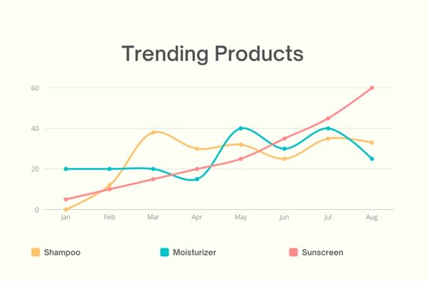
The following example seems to depict a rising trend of sunscreen products, however, it presents only the first half of the year that expectedly shows temperatures rise steadily from winter to summer:
Figure 3. Line graphs that show Shampoo, Moisturizer, and Sunscreen trends from January to August for a fictional company. The X-axis represents the months, and Y-axis represents the percent increase in trend. Since the temperatures are rising from January to August, more people are investing in sunscreen. As a result, this graph may lead people to believe that sunscreen products for this fictional company are rapidly increasing, when in reality, this is due to weather changes.
Pie Charts That Don't Add Up to 100%
Pie charts are often used to represent the relationship of parts to a whole, in percentage, and the parts of the whole would conventionally add up to 100%. A pie chart is a great way to visually break down data for use in storytelling, as a percentage to a whole. In business context, it can be used to show the percentages of the different types of customers, or percentage of sales among the different types of products.
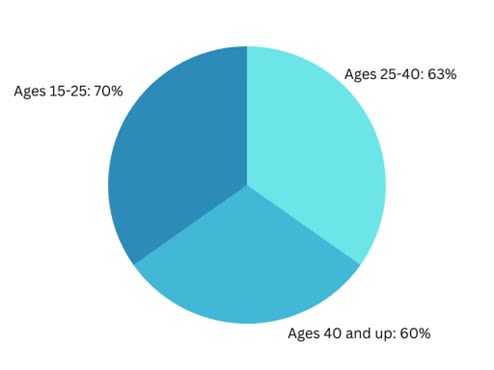
The following example shows the percentage of sales of a specific product among different age groups, in which the labels show that the percentage values add up to 193%. Because of the wrong use of the pie chart, the data presented becomes misleading:
Figure 4. Pie graph showing the percentage of sales of a specific product among different age groups. The pie graph totals 193%, which may be confusing and misleading to people because most pie graphs total 100%.
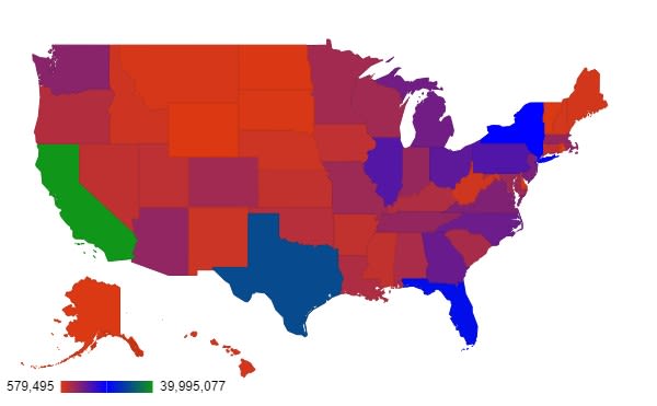
Unusual Color Usage in Maps
In order to effectively present statistical data for geographical areas or regions, choropleth maps have become increasingly popular as a data visualization tool. In this type of map, the dark colors are usually represented by higher values and lighter colors are represented by lower values. However, some would use unconventional color palettes to represent data in an attempt to amplify a statement or just to make the maps look more colorful, which only makes them more confusing and harder to read.
The following example is a simple representation of the distribution of population across the United States. But because of the unusual color palette used, the interpretation of the data may become difficult to understand:
Figure 5. The Choropleth Graph represents the distribution of population across the United States. The lower numbers in the population are represented in light red, and the higher numbers in the population are represented in the dark blue and green. This graph may be difficult to understand due to the unusual color selection, as most of the colors appear very similar.
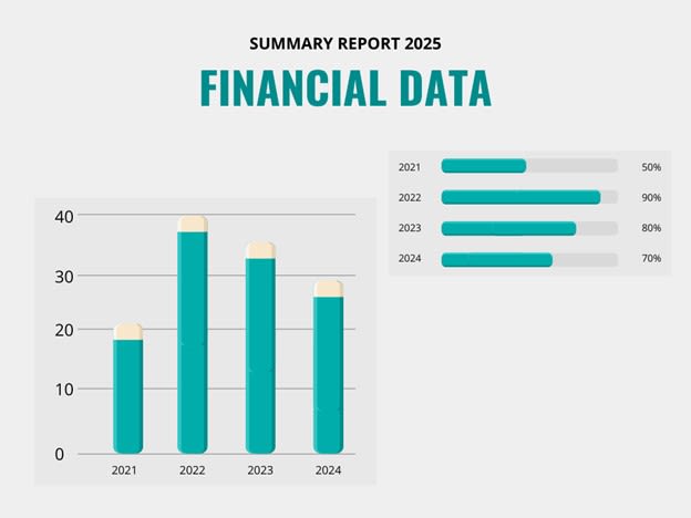
Focusing on a Partial and Favorable Time Period
Another common case of misleading data is by cherry-picking only a partial or favorable time period to present a result. In the case of sales or revenue reports, for instance, selecting only a peak season can give an inaccurate picture of the company's overall performance. In short, the time periods in charts or graphs greatly affects how data is perceived.
In the following example, the graph shows a summary report of a company’s overall financial data, in which the time period with low-performing sales may have been intentionally omitted:
Figure 6. The bar graph shows a summary of a fictional company’s overall financial report for the years 2021 to 2024. The X-axis represents the years, and the Y-axis represents the sales in millions. The bar graph shows that the company’s worst year was 2021, and the best year was 2022. However, this fictional company has left out its low-performing sales in this report.
How to Minimize the Impact of Misleading Data?
Since more and more organizations, industries, and other parts of society rely on data to inform their decisions, almost everyone has encountered misuse of data at some point. However, if you equip yourself with the right level of understanding and awareness, you can lessen the damage caused by misleading data.
Here are some suggestions for spotting misused data:
- Check the sources. Who is doing the research? Is the source credible? Knowing who does the research, who pays for it, and where the data source comes from will help determine whether the data being presented is reliable.
- Inspect the sample size and study length. Is the sample size reasonable? Is the length of study long enough? Using proper sampling methods, such as conducting surveys from random or varied age groups, to get data can help easily identify whether the size, type, and timing of collecting data samples make sense within the context being presented.
- Observe the data visuals used. Are the values represented fairly and accurately? Accurately and appropriately representing numerical data in visualization can be challenging and calls for specific storytelling techniques. It's also important to keep an eye on the spacing between values and the general aesthetics of the dashboard or chart to make sure there isn't too much going on visually.
- Review how questions are framed in surveys or polls. Does it use misleading words or phrases? Most survey questions are answerable by “yes” or “no,” so that the interpretation of results is easy and straightforward. However, if the question is constructed in a way that is manipulative or stirs emotion, then the results may turn out misleading statistics.
- If you are the one doing the research, then seek a third-party review to minimize bias. Is the analysis conducted in an objective and impartial manner? Since we all have our own set of unconscious biases, it's important to always seek a second opinion from a diverse group to ensure that any biases are taken into consideration, if not eliminated, when conducting or presenting data research and analysis.
The rapid growth of data is inevitable. Data is everywhere—digital, almost tangible, and readily accessible to anyone who desires to use it. We need to be well-versed in the best practices for interpreting data so that you can avoid being misinformed or misled. The common examples I discussed in this article will hopefully help you spot and avoid being influenced by data misuse.

