


Table of Contents
<< Read the previous article: What is Principal Component Analysis?
Principal Component Analysis (PCA) is an unsupervised learning algorithm for Dimensionality Reduction. It allows data visualization and improves interpretation and model efficiency, with the caveat that you must choose the appropriate number of PCA vectors. Choosing the number of components generally depends on the explainability of your model and can be assisted by statistical analysis.
Scikit-learn's implementation of PCA is not suited to every purpose. For example, text analysis is usually composed of enormous vectors decoded into sparse matrices, which can be problematic. In such cases it is very hard to pick the right number of components.
In this article I will dive deep into the mathematics behind PCA to understand the number of components and address the issue with sparse matrices. I will demonstrate how to implement PCA on a face recognition problem, indicating the steps to avoid in real-world scenarios. Ultimately, I’ll analyze the components' statistical significance to choose their number.
By the end of this article, you will:
- Understand the three steps you go through to transform data using PCA
- Understand the optimization problem behind PCA and its interpretation
- Understand how to pick how many PCA components you should use
- Get acquainted with a workaround for sparse matrices, including its pros and cons
What is Principal Component Analysis?
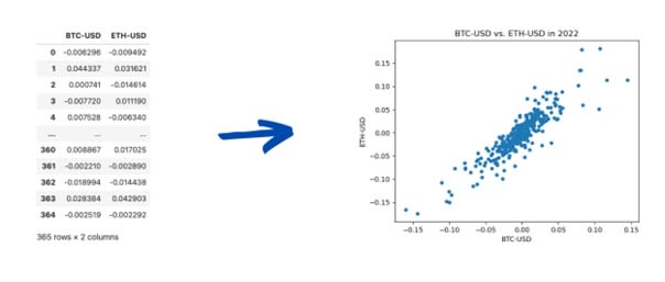
A standard bi-variate analysis process is understanding the correlation between features. Think of a tabular dataset as a set of row vectors: you see each feature as a dimension, and rows are points in the resulting high-dimensional space, like a scatter plot.
Below is gathered Bitcoin and Ethereum price percentage changes in 2022. You can consider each column as a dimension and each row as a point. In the right-hand graph, the graph considered Bitcoin as the horizontal axis and Ethereum as the vertical one.
Plotting two-column data as points in the plane, visually emphasizing their relationship.
Image Source: Edlitera
The two quantities are clearly correlated as both move up and down together. You commonly quantify this relation using the Pearson correlation coefficient. That is a number from –1 to 1 that measures how much the direction of both movements coincide. A similar measure is covariance, which considers each variable's magnitude.
In Linear Algebra, covariance would be related to an inner product between the two columns, while the Pearson correlation coefficient would be the cosine of their angle. A 0.5 correlation means that when the first variable moves one variance (i.e., one standard deviation squared), the second moves half variance. The covariance would use rather the explicit magnitudes of the variances instead of a half.
For the sake of clearing up how correlation works, a pair of variables with low correlation would look like this:
Image Source: Edlitera
The Bitcoin-Ethereum pair also illustrates a typical situation where columns have similar values. Sometimes the difference is only noise. In this case, dropping one column simplifies the dataset at a minimal cost. PCA aims to implement this idea by using covariance to infer relations between all the rows.
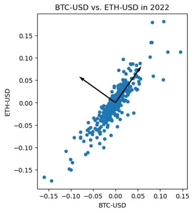
The first PCA vector is the unit vector with maximum summed covariance between all features. Hence, it represents the linear combination of features that will better explain the data. The second vector is produced similarly, but with one limitation: it must be orthogonal to the first PCA vector. This process repeats itself until you get to the last PCA vector. Usually, at that point, only noise is left in your data.
Below, the diagonal arrow represents the first PCA vector, following the BTC-ETH trend. The second vector is the orthogonal direction and is mainly generated by noise.
Finding the directions with maximal and minimal relations between BTC and ETH.
Image Source: Edlitera
This process shows its true might when you are working with high-dimension data, as you will see with image processing, where your dataset has dozens of thousands of features.
What is the Mathematics Behind PCA?
If you denote your feature set as \( X \) (in the case of a Machine Learning (ML) project, this is the dataset without labels), then the first PCA vector is the unit vector that maximizes the inner product:
\( \begin{align*} f: \mathbb{R}^n & \to \mathbb{R} \\v &\mapsto \langle (X-\mu) v , (X-\mu)v\rangle \end{align*} \)
Here \( X-\mu \) stands for the feature matrix with the mean of each feature removed. Recall that the variance of a random variable \( X_j \) is computed by:
\( \mathbb{E}[X_j-\mu_j]^2 = \mathbb{E}[X_j^2]-\mu_j^2 \)
A similar calculation shows that the inner product above is equivalent to multiplying the \( j \)th component of the vector \( v \) by the variance of the \( j \)th feature:
\( \sum_{i} \left(\sum_j(X_{ij}-\mu_j)v_j\right)^2 = \sum_{i,j}\left(X_{ij}^2-\mu_j^2\right) v_j^2 \)
The way you get to the expression on the right side of the above-mentioned equation is by writing out the left side of the equation in the following way:
\( \begin{align*} \sum_{i} \left(\sum_j(X_{ij}-\mu_j)v_j\right)^2 & = \sum_{i,j}X_{ij}^2v_j^2-2\sum_{i,j}\frac{1}{n}\sum_{k}X_{kj}v_jX_{ij}v_j + \sum_{i,j}\left(\frac{1}{n}\sum_{k}X_{kj}\right)^2 v_j^2 \\& = \sum_{i,j}X_{ij}^2v_j^2-2\sum_{i,j}\left(\frac{1}{n}\sum_{k}X_{kj}\right)^2v_j^2 + \sum_{i,j}\left(\frac{1}{n}\sum_{k}X_{kj}\right)^2 v_j^2 \\& = \sum_{i,j}\left(X_{ij}^2-\mu_j^2\right) v_j^2\end{align*} \)
By analyzing the equation above you can come to a few conclusions:
- The first PCA vector is the linear combination of features with the greatest total variance.
- The second PCA vector is the solution to the same optimization problem but is constrained by orthogonality to the first PCA vector.
- The third PCA vector must be orthogonal to the first and the second vector.
In practice, the last PCA vector does not go through an optimization process for it commonly consists of noise and outliers.
To summarize, you can say that the mathematical implementation of PCA simply finds a basis of orthonormal eigenvectors to the matrix \( (X-\mu)^T(X-\mu) \), ordered by decreasing eigenvalues.
Article continues below
Want to learn more? Check out some of our courses:
How to Prepare PCA Data
To showcase the power of PCA, I’ll demonstrate how you can use it when solving a face recognition problem. The data I’ll use are images from the Cropped Extended Yale Face Dataset B, available here. The dataset consists of 39 individuals with neutral expressions, 65 photos each, cropped to the person's face. It encompasses 64 different light angles plus an ambient picture. The task is to identify the model correctly, using the model number as the target label.
To keep the focus on PCA and not on preparing data, I’ll simplify the data preparation process. Instead of using the images themselves, I’ll use a version of the dataset where the images have been converted into arrays and already split into training and testing data. This process of separating data into training and testing data and converting images to an array is something I would need to do anyway before feeding data into a model, so, for this demonstration, I can assume that the data has already been preprocessed for me. This will allow me to focus on explaining PCA in detail instead of spending a lot of time on dataset preparation.
The first thing you always do, no matter what project you are working on, is import the libraries that you plan on using:
# Import everything we need
import pandas as pd
import numpy as np
import matplotlib.pyplot as plt
import matplotlib.cm as cm
from time import time
from sklearn.linear_model import LogisticRegression
from sklearn.preprocessing import StandardScaler
from sklearn.decomposition import PCA
from sklearn.pipeline import make_pipeline
After importing everything I plan on using it is time to load our preprocessed data. To do so, I will use the read_csv method from Pandas, because my data is stored in CSV files:
# Load training and testing data from CSV files
X_train = pd.read_csv(
    "https://edlitera-datasets.s3.amazonaws.com/Yale_image_array_train.csv"
)
y_train = pd.read_csv(
    "https://edlitera-datasets.s3.amazonaws.com/Yale_label_array_train.csv"
)
X_test = pd.read_csv(
    "https://edlitera-datasets.s3.amazonaws.com/Yale_image_array_test.csv"
)
y_test = pd.read_csv(
    "https://edlitera-datasets.s3.amazonaws.com/Yale_label_array_test.csv"
)
It is more practical to work with NumPy arrays, so let's convert our data into ndarrays:
# Convert data to NumPy arrays
X_train = X_train.values
y_train = y_train.values.ravel()
X_test = X_test.values
y_test = y_test.values.ravel()
I could move on to creating a custom implementation of PCA right now, but let's take a quick detour and create a function that will allow me to visualize the images that have been converted into arrays. This will make it much easier to understand what is happening in each step I go through when creating the custom implementation of PCA.
# Create function that will allow us to visualize images
# The original image size is 192 x 168
def show_image(images, original_shape=(192, 168)):
Shows the images from row vectors. If a list of row vectors is passed, it shows a row of images.
 if not isinstance(images, list):
        images = [images]

    # Stacking multiple images
    image = np.hstack([img.reshape(original_shape) for img in images])
    plt.figure(figsize=(4*len(images),4))
    plt.imshow(image, cmap=cm.Greys_r)
    plt.show()
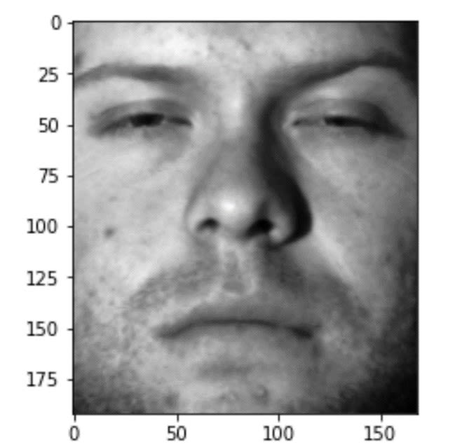
Let's check if my function works by displaying an image from my training set of images.
# Display an image
show_image(X_train[10, :])
The result I get by running the code above is the following image:
the10th image in the randomly chosen training set.
Image Source: Yale Face Dataset B, https://www.kaggle.com/datasets/tbourton/extyalebcroppedpng
It looks like the code works. Now that all preparations have been made, I can move on to creating a custom implementation of PCA.
How to Perform Custom Implementation of the PCA Algorithm
My implementation consists of three steps. I’ll start by subtracting the average of each column, consequently centering the data to its mean. Then, I’ll compute the Singular Value Decomposition of the resulting matrix, i.e., the Eigenvectors of (X – μ)T(X – μ). Finally, I’ll project the whole dataset to the selected number of PCA vectors. All in all, I will have to write just a few lines of code.
One thing worth mentioning here: avoid the first step when dealing with sparse matrices. Subtracting the mean populates most of the matrix with non-zero entries, making it dense rather than sparse.
First Step
To accomplish the first step, I calculate the average face and subtract it from the training and test sets. The result is a dataset centered at zero, which I denote as X_centered. The exciting part of dealing with images is that you can visualize the results, so after computing the average face I am going to display what it looks like:
# Computing the average face
average_face = X_train.mean(axis=0)

# Display the average face
show_image(average_face)
The image I get by running the code above can be seen below:
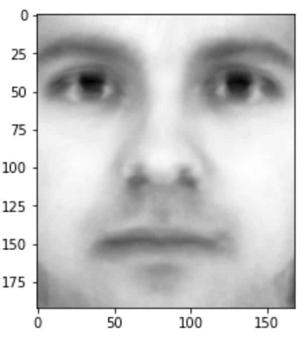
Image Source: Yale Face Dataset B, https://www.kaggle.com/datasets/tbourton/extyalebcroppedpng
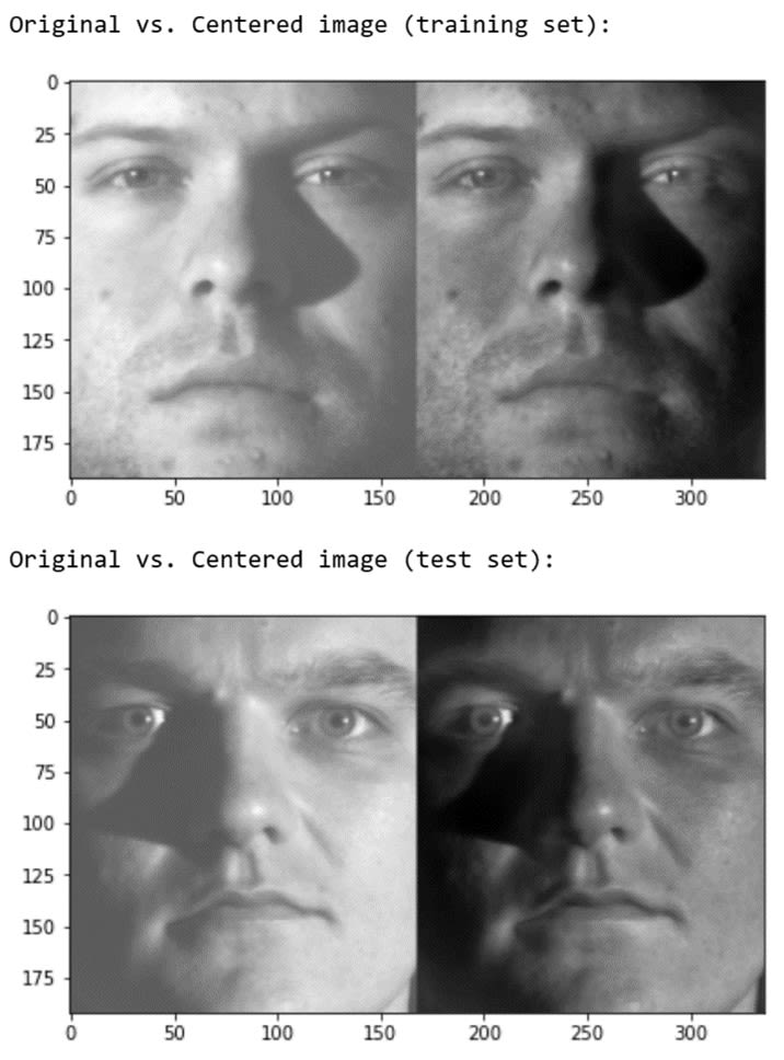
After calculating the average face, I can use the result to center my train and test sets.
# Center the train and test sets
X_train_centered = X_train - average_face
X_test_centered = X_test - average_face
To prove my code works, I’ll compare images from the centered versions of the train and test sets to the images from the original versions of the train and test sets:
# Compare the centered images with the original images
print('Original vs. Centered image (training set):')
show_image([X_train[15,:], X_train_centered[15,:]])
print('Original vs. Centered image (test set):')
show_image([X_test[30,:], X_test_centered[30,:]])
The result I get by running the code above is:
Randomly picked training images (on the left) and their centered counterpart (on the right).
Image Source: Yale Face Dataset B, https://www.kaggle.com/datasets/tbourton/extyalebcroppedpng
Second Step
I can now move on to the most resource-demanding part of PCA, which is computing the Singular Value Decomposition.
In principle, there are two standard ways you can obtain the decomposition: using numpy.linalg.eig or numpy.linalg.svd API. Both of these methods are very computationally expensive. Fortunately, there is a third, more efficient way of computing what you need. The idea is described in Eigenface's Wikipedia and relies on avoiding calculating eigenfaces as X_centered @ X_centered.T, and instead calculating them as X_centered.T @ X_centered. This simple change drastically reduces computation time, bringing it to less than 7 seconds.
# Start measuring time
start = time()

# Computing eigenfaces
A = np.matmul(X_train_centered, X_train_centered.T)
Lambda, V = np.linalg.eig(A)
V = (X_train_centered.T @ V)

# Stop measuring time
end = time()

# Print how long it took to compute the eigenfaces
print(f'Execution time: {round(end-start,4)}s')
Execution time: 6.295s
I now have the Eigenfaces as the columns of the NumPy array V. There are 540 Eigenfaces, each being a 32256-long vector (32256=192x168 is the original number of features).
If I want to make sure that is true, I can always check the shape of the array itself:
# Check the shape of the data
V.shape
I’ll also visualize the Eigenfaces, to demonstrate what they look like:
# Display the eigenfaces
show_image([V.T[i,:] for i in range(10)])
The result I get by running the code above is the following visualization:
(32256, 540)
Visualizing the first 10 Eigenfaces related to the training set:
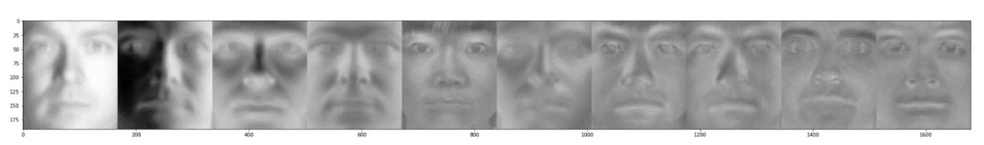
Image Source: Yale Face Dataset B, https://www.kaggle.com/datasets/tbourton/extyalebcroppedpng
Third Step
The last step is to project each row to each PCA vector. Since the latter are unitary, there is a simple expression realizing the operation: row @ PCA_vector. The projection discloses a new statistical interpretation, the explained variance ratio. Since the variance of a dataset is roughly the sum of all features squared, the explained variance ratio of a vector will be the ratio between the projection's variance and the variance of the whole dataset.
Following this train of thought you can conclude that PCA vectors will then be the vectors with maximal explained variance. This interpretation plays a crucial role when choosing the number of PCA components.
Let's create a function that I can use to compute the features defined by the PCA vectors:
# Create a function that computes the features defined by PCA vectors
def get_F(n,V, X):
    '''
    Outputs the first n eigenfeatures of the matrix X.
    '''

    F = X @ V[:,:n]
    return F
Now that my function is ready, I can use it to get the features I am interested in:
# Use the function to get the features
# To demonstrate, let's take the first ten eigenfeatures of the train set
F_train = get_F(10, V, X_train_centered)
Let's look at what our F_train array looks like:
Image Source: Yale Face Dataset B, https://www.kaggle.com/datasets/tbourton/extyalebcroppedpng
How to Apply PCA to Face Recognition
In this last section, I’ll compare the accuracy score using a different number of Eigenfaces. I’ll brute-force my way by computing the test scores using from 1 to 200 Eigenfaces. This is not something I typically do in practice, because it is far more efficient to find the optimal number of eigenfaces instead of training 200 versions of our model, but for the sake of demonstration, it is what I’ll do right now. I’ll focus on making the whole process more efficient later. For now, let's define the model, train it with different numbers of eigenfeatures and compare the results.
# Define the model
model = LogisticRegression(solver='liblinear', max_iter=5000)

# Create an empty list of scores
scores = []

# Train and score models for different numbers of eigenfeatures
for n in range(1,201):
    F_train = get_F(n, V, X_train_centered)
    F_test = get_F(n,V, X_test_centered)
    model.fit(F_train, y_train)
    score = model.score(F_test, y_test)
    scores.append(score)
While I could take a look at the list of scores to see how well my model performs using various numbers of eigenfeatures, it is much more practical to create a visualization using matplotlib and analyze that visualization instead:
# Create visualization
plt.plot(range(1,201), scores)
plt.title('Test scores')
plt.xlabel('Number of faces')
plt.ylabel('Accuracy score')
Running the code produces the following visualization:
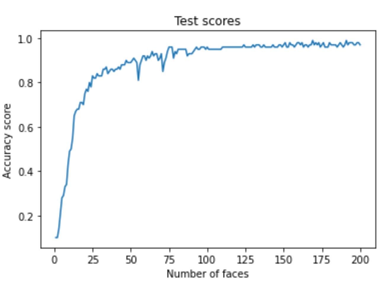
Image Source: Yale Face Dataset B, https://www.kaggle.com/datasets/tbourton/extyalebcroppedpng
I get an accuracy of almost 90% with only 25 features. While these are impressive results, I can't deny the fact that I brute-forced my way to finding out how many features I need to produce such a good result.
Let's avoid brute forcing the way to the solution and find a way to select the number of components in a more intelligent way using Scikit-learn's PCA pipeline.
How to Select the Optimal Number of Components
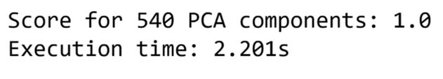
There are two analytical techniques for selecting the number of components we can use that are more efficient than brute forcing our way to the optimal number of components. I’ll make the first run of the PCA pipeline with the full set of significant components. That will serve as a baseline accuracy for the variance analysis. I fixed 540 PCA vectors since any extra vector has zero explained variance. Let's find out how close I can get to the baseline accuracy using fewer features.
I’ll use the make_pipeline function to create a pipeline of three estimators that my data will go through in the following order:
- First, I’ll scale the data using the StandardScaler()
- Then I'll run the data through the PCA algorithm with n components
- Finally, I'll train a LogisticRegression model and evaluate its performance
# Create the function that will create the pipeline
# and allow you to run the model and evaluate it
def get_model_score(n):
It creates a pipeline and uses it to train and score a LogisticRegression model.
 pipe = make_pipeline(
        StandardScaler(),
        PCA(n_components=n),
        LogisticRegression(solver='liblinear',max_iter=5000))

    pipe.fit(X_train_centered, y_train)
    score = pipe.score(X_test_centered, y_test)

    print(f'Score for {n} PCA components: {score}')
    return pipe
Now I can run my pipeline with the original number of features. Let's also measure how long it takes to run the pipeline in seconds.
# Start measuring time
start = time()

# Run the pipeline
pipe = get_model_score(540)

# Stop measuring time
end = time()

# Print how many seconds we needed to run the pipeline
print(f'Execution time: {round(end-start,4)}s')
I can now retrieve the trained PCA algorithm from the pipeline and use it to compute the explained variance ratio of its components. This ratio measures how much information each component codifies from the dataset. I’ll plot the first 40 ratios. I’ll call this a scree plot.
# Retrieve the trained PCA algorithm
pca = pipe[1]

# Fixing the number of components to analyze
n_values = 40

# Create the scree plot
plt.plot(range(n_values), pca.explained_variance_ratio_[:n_values], 'o-')
plt.title('Scree Plot')
plt.xlabel('Principal Component')
plt.ylabel('Explained Variance')
plt.show()
The code above will create the following visualization:
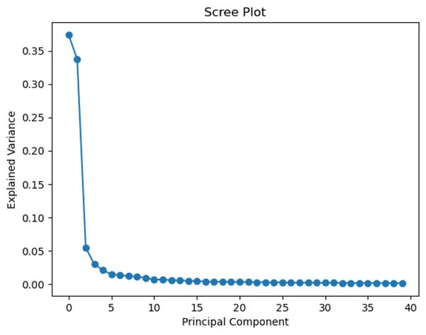
Image Source: Yale Face Dataset B, https://www.kaggle.com/datasets/tbourton/extyalebcroppedpng
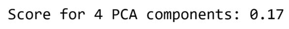
The rule of thumb is to choose the number where the plot forms an “elbow.” My graph has an apparent elbow-like angle at n=4. However, four elements turn out not to be enough for the classifier to achieve a good result:
# Run the pipeline with four principal components
get_model_score(4)
Running the pipeline with only four components will lead to the following result:
I’ll plot it below:
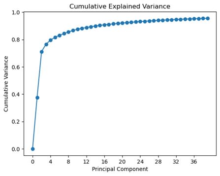
# Create a cumulative variance plot
plt.plot(range(n_values),[sum(pca.explained_variance_ratio_[:i]) for i in range(0,n_values)], 'o-')
plt.xlabel('Principal Component')
plt.ylabel('Cumulative Variance')
plt.title('Cumulative Explained Variance')
plt.xticks(range(0,n_values,n_values//10))
plt.show()
Running the code above will create the following visualization:
Summing up the Explained variance of each Principal Component to understand what a minimal acceptable threshold would be
Image Source: Yale Face Dataset B, https://www.kaggle.com/datasets/tbourton/extyalebcroppedpng
In the plot above it is easy to notice that four components correspond to nearly 80% of the total variance. That seems insufficient, so let's set a new threshold. For example, let's use twenty-one components so that we make sure to explain 85% of the variance.
# Run the pipeline with twenty-one principal components
get_model_score(21)
I get a much better score when using 21 PCA components. While the score is not as good as when I used all the features, the training process is going to be much faster.
Using these two tests I can choose the optimal number of PCA components without needing to use a brute force approach. This way I kept the computational cost as low as possible and avoid running into problems when working with large datasets, where using a brute force approach is not feasible.
PCA is a mighty feature engineering process that improves the efficiency of an ML algorithm. It allows you to greatly decrease the amount of data you need to use to train a machine learning model, which in turn allows you to create much more efficient machine learning pipelines.
In a previous article, I explained the basic idea behind PCA. In this article, I took a more hands-on approach. I started by explaining the math behind PCA and followed that up by creating a custom implementation of the PCA algorithm. In my custom implementation, I used a brute force approach to picking the optimal number of components to use. To finish off, I explained how you can instead use the PCA algorithm that is built into Scikit-Learn and leverage the power of Scree and Cumulative Variance plots to find the optimal number of components in a much more efficient and intelligent manner.
![[Future of Work Ep. 6] The Future of Renewable Energy with Molly Bales](https://res.cloudinary.com/edlitera/image/upload/ar_16:9,c_fill,f_auto,q_auto,w_100/rodmmvqbh2spymcowfyumm9j421w?_a=BACJ3SGT)
