


Table of Contents
A lot of aspiring data scientists and machine learning engineers learn early on that creating visualizations is an integral part of data analysis. While at first, it may seem daunting moving away from visualizations created by data processing libraries such as Pandas, but it is generally a good idea to expand your visualization toolkit. Sooner or later you will have to learn how to use a library that is specifically designed for creating visualizations.
- How to Create Visualizations Using Matplotlib
- Pandas vs. Excel: Which is the Best for Data Analysis?
Many default to using Matplotlib when they need to create visualizations because it is the most popular and flexible library, offering you everything you need to create very complex, fully customizable visualizations. But the thing is, in most cases, you won't need the full power of Matplotlib, because the day-to-day visualizations you need to create will usually not be that complex. That leaves you with the following question: is there a library that makes it easier and less fussy to create common visualizations than Matplotlib?
There is, and that is the Seaborn library. In this article, I'll explain how you can use the Seaborn library to access most of the functionality of Matplotlib without actually needing to write a lot of code.
What is Seaborn and Why Should You Use It?
Seaborn is one of the most popular data visualization libraries in Python, built on top of Matplotlib, it enables users to create attractive and informative statistical graphics. Put simply, you can think of Seaborn as a high-level interface for Matplotlib, with some added functionality. There are many reasons why you should consider using Seaborn over using the Matplotlib library directly. Here are a few of them:
- Seaborn is easier to use because you don't need to write a lot of code to create complex visualizations such as multi-plot grids.
- Seaborn includes several built-in themes and color palettes that can be easily applied to plots, making them visually more appealing.
- Seaborn contains built-in functions for plotting common statistical models, such as linear regression and logistic regression models, which saves time and effort when you are working on projects that use these statistical model.
It is also worth mentioning that Seaborn is built on top of Matplotlib and integrates with it perfectly. If you need the full power of Matplotlib because you need to highly customize your visualization, you can just create the visualization using Seaborn, then customize it using Matplotlib code.
To demonstrate how Seaborn works, I'm going to create a few different types of visualizations using it. But before I move on, I'll explain how to install Seaborn. Installing it is straightforward and can be done using pip, the package manager for Python. You just need to navigate to the Python environment you are using and type in: pip install seaborn. And that's all there is to it. You can also install Seaborn directly from a Jupyter notebook, by typing in !pip install seaborn into a code cell and then running that code cell.
After installing Seaborn, it's time to import it:
# import the seaborn library
import seaborn as sns
Typically, Seaborn is imported under the alias sns. Now, to demonstrate how you use Seaborn, I'm going to import a dataset directly from Seaborn. Seaborn has some popular machine learning datasets built-in as example datasets that you can use to practice creating visualizations. Let's load the penguins dataset using the load_dataset function from Seaborn. This will automatically create a DataFrame from the data.
Let's look at what the DataFrame looks like:
# load the data and create a DataFrame
df = sns.load_dataset("penguins")
df
Running the code above will return the following result:
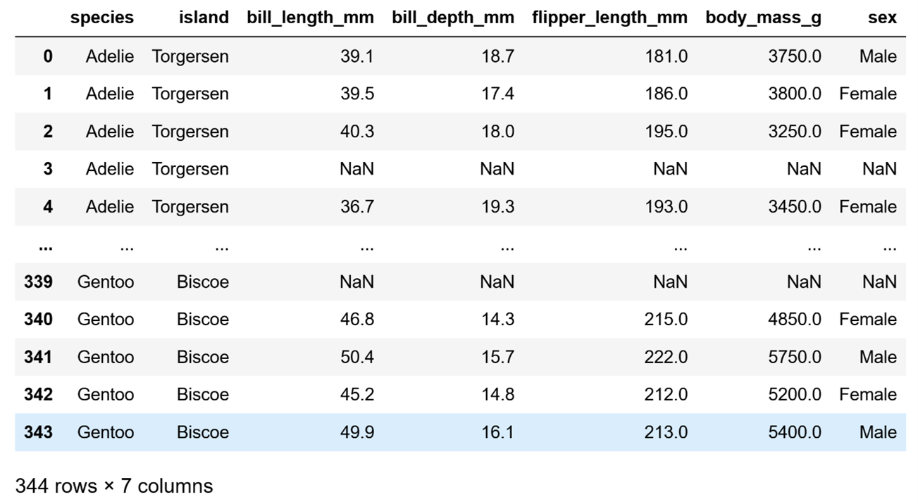
Image Source: Edlitera
Let's clean up the data a bit. I'll remove the rows with missing values just so I don't need to worry about those when I move on to creating visualizations:
# remove missing data
df.dropna(inplace=True)
Now that I have removed the rows that were missing data, let's start doing some analysis. I am going to first analyze the numerical data, and then the categorical data.
How to Visualize Data With Seaborn
To analyze numerical data, I will create the following visualizations for all of the columns that contain numerical data:
- Histograms and KDE plots
- Box plots
- Violin plots
- Bar plots and count plots
- Scatter plots
Article continues below
Want to learn more? Check out some of our courses:
How to Create Histograms and Kernel Density Estimation (KDE) Plots
Histograms are used to represent the frequency distribution of a set of data by dividing the data into bins and counting the number of data points that fall into each bin. The height of each bar in the histogram represents the count of data points in the corresponding bin. Histograms are useful for visualizing the overall shape of a distribution, including the presence of any outliers or skewness.
Kernel Density Estimation (KDE) plots are used to represent the probability density function of a set of data. The KDE plot shows the estimated probability density of the data at each point, based on a kernel function that smooths the data. KDE plots are useful for visualizing the shape of a distribution in more detail than a histogram, and for estimating the underlying probability density function of a set of data.
These two types of visualizations complement each other very nicely, which is why you can create them in Seaborn both separately and together. In most cases, you want to create them together, and to do so you can use the displot() function. I’ll demonstrate how you can use it to create a visualization by creating a histogram and a KDE plot for the body_mass_g column.
First, let's define which column I want to create a visualization for, and to which DataFrame that column belongs to:
# Create histogram and KDE plot
sns.displot(x = "body_mass_g", data=df, kde=True)
Do take note that I set the value of the kde parameter to True because I wanted to get not only a histogram, but also a KDE plot. If I want to get just a histogram I can just run the same code but set the value of the parameter to False.
Running the code will return the following visualization:
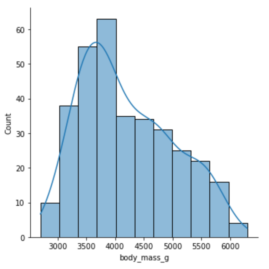
Image Source: Edlitera
Just by looking at this visualization, you can immediately tell everything you need to know about the distribution of the data in that column. It is easy to notice that it somewhat resembles a normal distribution and that it is positively skewed. While you can create only a histogram using the same function, to create a visualization that displays only a KDE plot you need to use a different function, the kdeplot() function.
I’ll demonstrate how you can create a KDE plot:
# Create a KDE plot
sns.kdeplot(x="body_mass_g", data=df)
Running the code above will return the following visualization:
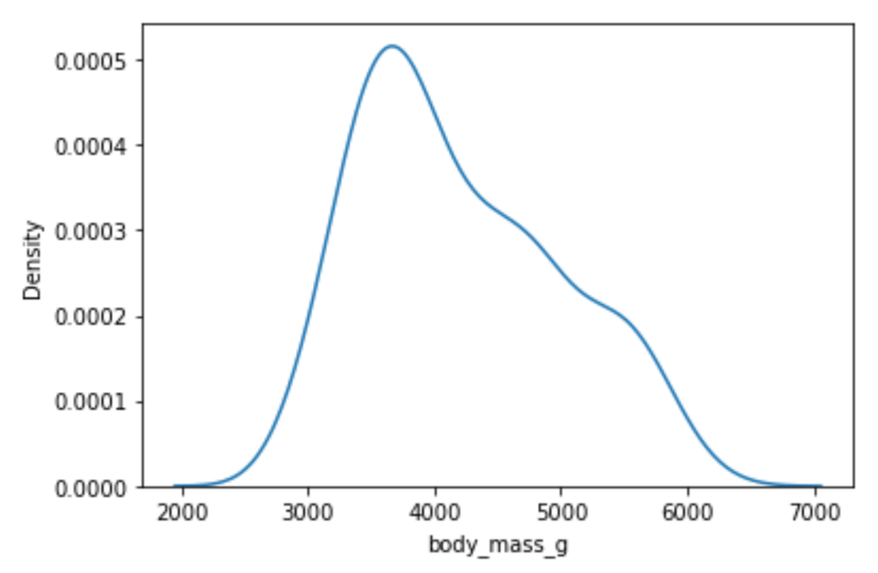
Image Source: Edlitera
Histograms and KDE plots tell you a lot about the distribution of your data, but they don't tell you whether there are any outliers in your data. To determine that, we'll need to use box plots.
How to Create Box Plots
Box plots are plots you can use to represent the distribution of a set of numerical data. They are particularly useful for visualizing the range and spread of data, as well as detecting outliers and skewness. A box plot consists of a box and two whiskers, as well as potential outliers, which are plotted as individual points. The box represents the interquartile range (IQR), which is the range between the 25th and 75th percentiles of the data. The whiskers represent the minimum and maximum values of the data, excluding outliers. Outliers are defined as data points that fall outside of 1.5 times the IQR.
To create a box plot you use the boxplot() function from Seaborn, passing in the parameters in a similar way to how you pass them to the displot() and kdeplot() functions.
I’ll create a box plot for my bill_length_mm column to demonstrate:
# Create a box plot
sns.boxplot(x="bill_length_mm", data=df)
Running the code above will return the following visualization:
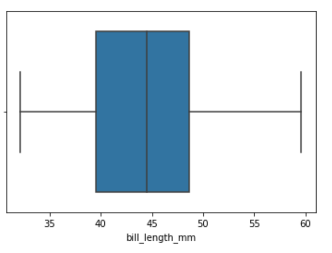
Image Source: Edlitera
By looking at this box plot, you can tell that there aren't any outliers in my data. One other thing I can do is pass a value to the y argument, which will allow us to see the connection between this feature and another. You'd typically do this to analyze the connection between your independent and dependent features.
I'll run the following code to see the connection between my independent and dependent variables:
# Create a box plot
sns.boxplot(x="bill_length_mm", y="species", data=df)
Running the code above will return the following visualization:
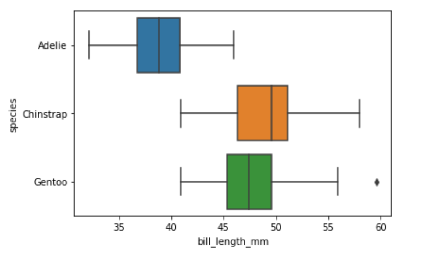
Image Source: Edlitera
You can immediately see that there is a significant difference between the bill length of Adelie penguins and the other two types of penguins. Also when you create box plots like this you can see that there are some outliers noticeable if you are just looking at the bill length of Gentoo penguins. By looking at box plots you can also get a relatively good idea of whether your data is skewed or not. However, you can't be 100% certain. That's why I'll create a violin plot.
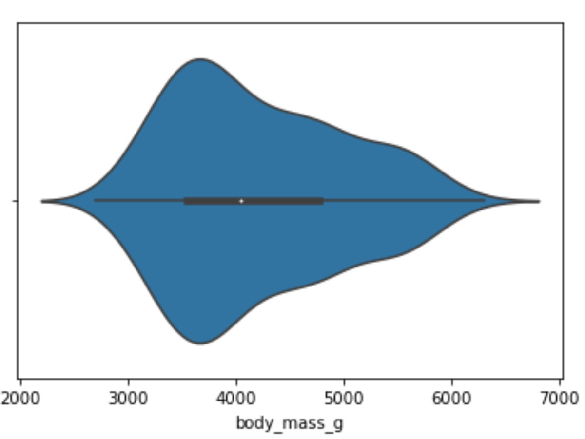
How to Create Violin Plots
Violin plots are data visualization techniques that combine aspects of box plots with KDE representation. The violin plot is composed of a series of vertical shapes that resemble a violin, hence its name. The width of each violin shape is proportional to the density of the data at the corresponding value, with wider shapes indicating higher density and narrower shapes indicating lower density. Additionally, each violin shape contains a box plot, which depicts the median, quartiles, and outliers of the data.
One of the main advantages of using violin plots is their ability to convey more detailed information about the distribution of the data compared to traditional box plots. The violin plot conveys not only the central tendency and spread, but also the shape of the distribution, which can be useful in identifying skewness or multimodality.
To create a violin plot you use the violinplot() function from Seaborn, passing in the parameters in a similar way to how I passed them to the previously demonstrated functions. I’ll create a violin plot for our body_mass_g column, the same one I created a histogram and a KDE plot for, to demonstrate:
# Create a violin plot
sns.violinplot(x="body_mass_g", data=df)
Running the code above will return the following visualization:
A violin plot of penguins' body mass, made with the violinplot() function from the Seaborn library.
Image Source: Edlitera
You can see that my data is a bit skewed by looking at this violin plot. Also, if you look very carefully, you notice that this skewness is also noticeable on the box plot that is inside the violin shape.
Next, let's see how body mass changes based on different species:
# Create a violin plot
sns.violinplot(x="body_mass_g", y="species", data=df)
Running the code above will return the following visualization:
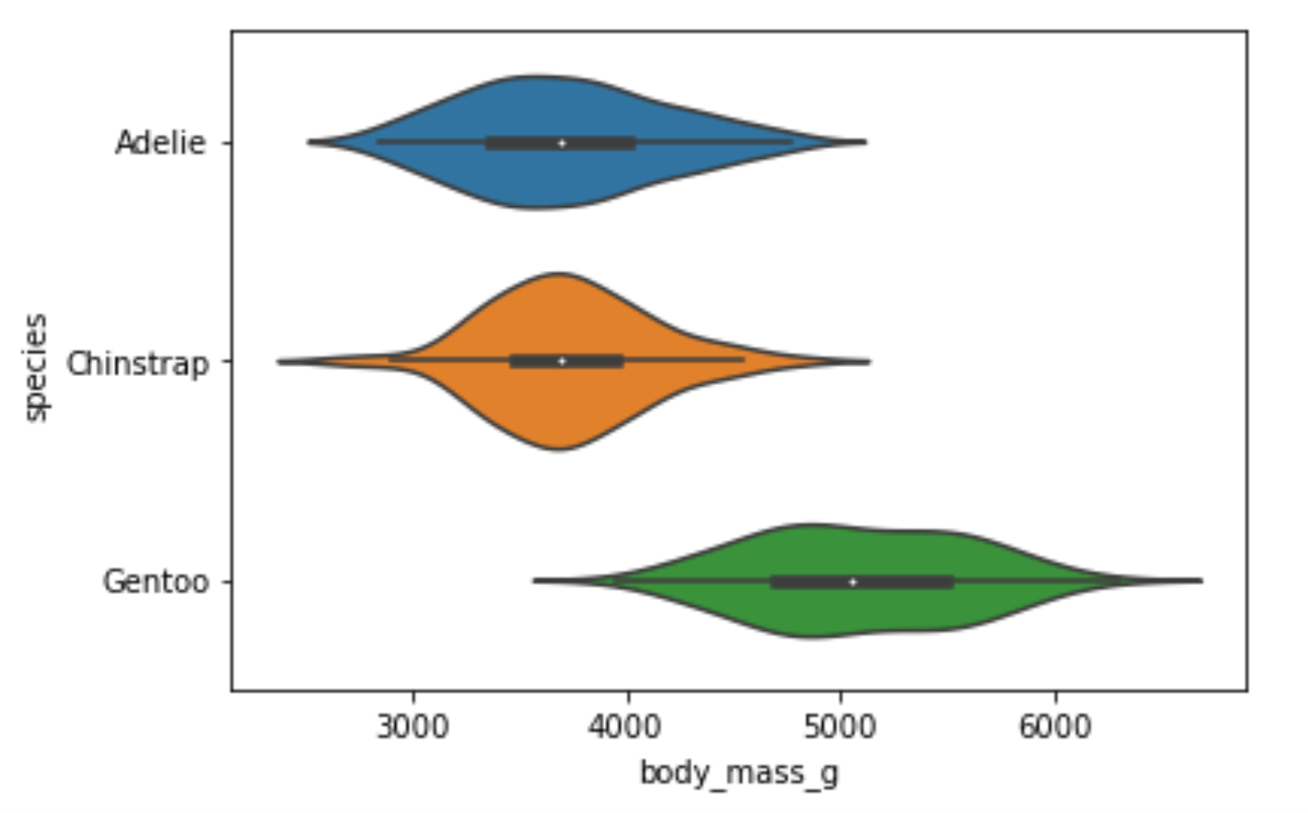
Image Source: Edlitera
The difference in weight between the Adelie and Chinstrap species is not noticeable. However, you can easily notice that the Gentoo species is on average much heavier than the other two species. This means that the body_mass_g feature would probably be very useful if I wanted to predict the species of a penguin.
How to Create Bar Plots
A bar plot is a type of chart that is used to display the relationship between a categorical variable and a numerical variable. In a bar plot, the categorical variable is represented on one axis (usually the x-axis) and the numerical variable is represented on the other axis (usually the y-axis). Each category is represented as a bar, and the height of each bar represents the value of the numerical variable for that category.
To create a bar plot using Seaborn you use the barplot() function. I'll create a bar plot that will tell me how long the flippers of different penguin species are:
# Create barplot
sns.barplot(x="species", y="flipper_length_mm", data=df)
Running the code above will return the following visualization:
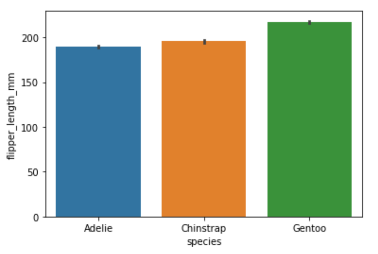
Image Source: Edlitera
This bar plot confirms what you noticed from the previous visualizations: the Gentoo penguins seem to be much larger than the two other species of penguins. On this bar plot, you see that their flippers are longer. Earlier, when I created violin plots, you could see that they are much heavier than the other two species of penguins. Aside from creating these classic bar plots, there is a simplified version of a bar plot that you can create called a count plot.
How to Create Count Plots
Count plots are used to represent the count of each category in a categorical variable. They show the number of occurrences of each category as the height of the bars. A count plot is a simpler representation of a bar plot where the y-axis shows the count and the x-axis shows the categories. They are often used to check for an imbalance between values inside some categorical variable. For example, when you perform classification, you ideally want to have the same number of examples from each of your classes when training your model.
To create a count plot using Seaborn, you use the countplot() function. I'll create a count plot to check how many examples of each penguin species I have in my data:
# Create countplot
sns.countplot(x="species", data=df)
Running the code above will return the following visualization:
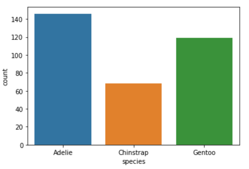
Image Source: Edlitera
As you can see, while the imbalance between the Adelie and Gentoo species is not too large, we have very little data about the third species of penguins. If I wanted to train a multiclass classification model on this data, my results would probably not be very good for that third class.
Finally, we may also want to analyze the relationship between two numerical variables. The most appropriate way to analyze such a relationship is by creating a scatter plot.
How to Create Scatter Plots
Scatter plots are a type of data visualization that you can use to explore the relationship between two numerical variables. You use them to identify any patterns or trends in data. In a scatter plot, each data point is represented as a dot on a two-dimensional graph. The position of the dot on the x-axis represents the value of one numerical variable, while the position of the dot on the y-axis represents the value of the other numerical variable. By plotting the data points in this way, it is possible to see the relationship between the two variables and to identify any patterns or trends in the data.
To create a scatter plot using Seaborn, you use the scatterplot() function. I’ll display the relationship between the weight of a penguin and its bill length by creating a scatter plot:
# Create a scatterplot
sns.scatterplot(x="bill_length_mm", y="body_mass_g", data=df)
Running the code above will return the following visualization:
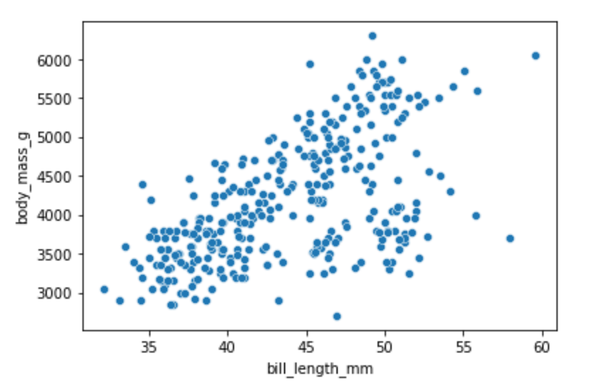
Image Source: Edlitera
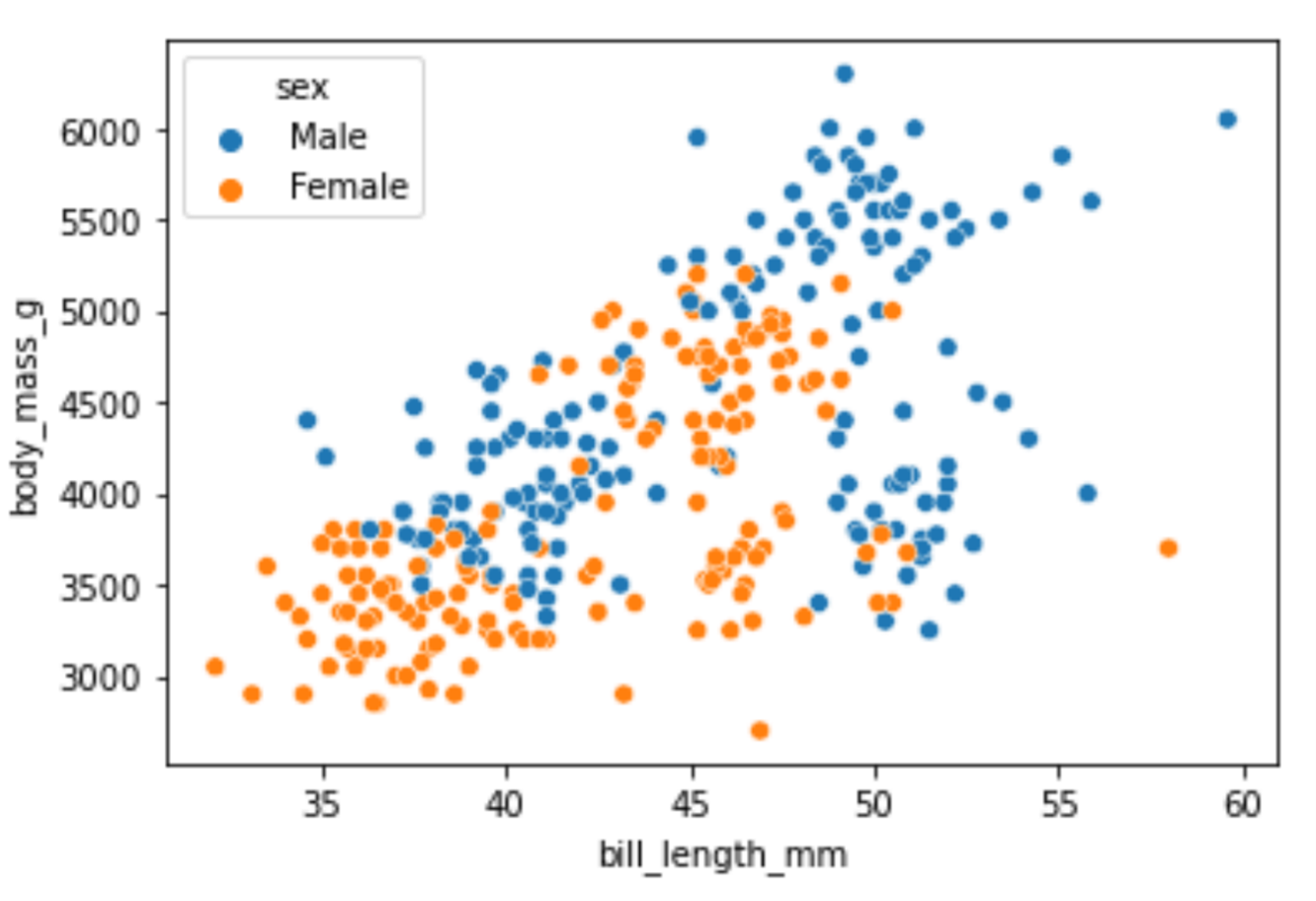
There is a noticeable pattern in the visualization: as the weight of a penguin increases, so does the bill length. We can add even more information to this plot using the hue parameter. The value of the hue parameter will indicate that the points of my scatter plot should be colored based on the values in some third column.
Let's create the scatter plot again, only this time also displaying the difference between male and female penguins:
# Create a scatterplot
sns.scatterplot(x="bill_length_mm",
                y="body_mass_g",
                hue="sex",
                data=df)
Running the code above will return the following visualization:
A scatter plot showing the relationship between bill length on the x-axis and body mass in the y-axis, with male penguins in blue and female penguins in orange.
Image Source: Edlitera
In most animal, species males will on average be bigger than females, so it makes sense that male penguins, in general, weigh more and have bigger bills compared to female penguins.
In this article, I covered how to create several different visualizations using the Seaborn library. I focused on the visualizations that are used most often in practice, and demonstrated how you can create them using a single line of code. Of course, the Seaborn library offers many more types of visualizations than can be covered in just one article. However, like the ones shown above, most other Seaborn visualizations can also be created using a single line of code.
Also, keep in mind that Seaborn is built on top of Matplotlib. This means that you can very easily modify the appearance of all of the visualizations using the same code you would typically use to modify Matplotlib visualizations. To learn more about how to use Matplotlib, take a look at the previous article in this series of articles on creating visualizations.

